
There’s something magical about walking into a living room that feels like a warm embrace. The atmosphere is cozy, the colors are inviting, and every detail seems to whisper comfort. The secret to achieving that kind of space often lies in your color palette. Warm colors — from earthy neutrals to vibrant reds, golden yellows, and burnt oranges — can completely transform a room into a sanctuary that feels stylish, timeless, and welcoming.
In this article, we’ll explore 15 warm living room color ideas. Each one is designed to inspire you with practical tips, color psychology insights, and styling advice that you can actually use. Whether you love deep, dramatic tones or softer, sunlit shades, there’s a warm palette here for you.
1. The Science of Warm Colors
Before we jump into palettes, it helps to understand why warm colors work so well in living rooms. Reds, oranges, yellows, and warm neutrals stimulate our senses and create intimacy. They reflect light in a way that adds a golden glow to the room — making us look and feel better in the space.
Warm hues also remind us of comforting natural elements: fire, sunsets, autumn leaves, candlelight. These associations tap into our emotions, creating a subconscious sense of safety, coziness, and joy. That’s why even a single warm accent wall or piece of furniture can instantly change how your space feels.
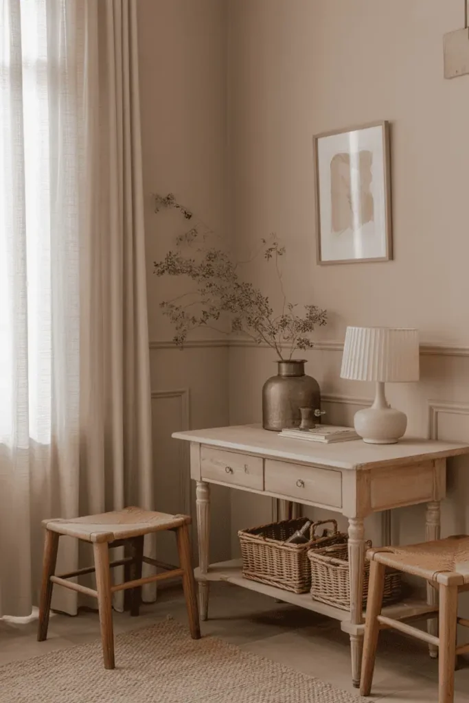
2. Earthy Foundation Colors
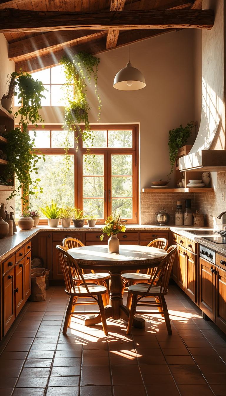
Earthy neutrals are the backbone of warm living rooms. Think camel, mushroom gray, warm taupe, and sandy beige. These hues provide a stable, grounded backdrop that allows bolder colors to shine.
Use them for walls, flooring, or large-scale furniture pieces like sofas and sectionals. Pair earthy tones with natural textures — wood, linen, wicker — to amplify the cozy factor. They’re timeless, adaptable, and make seasonal decorating changes a breeze.
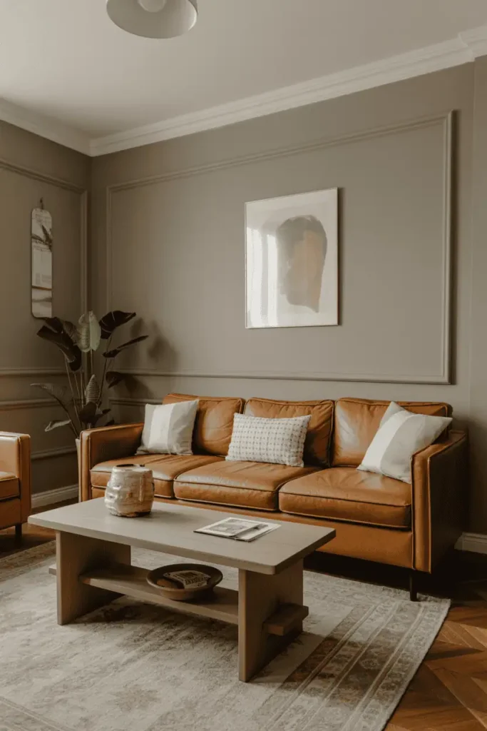
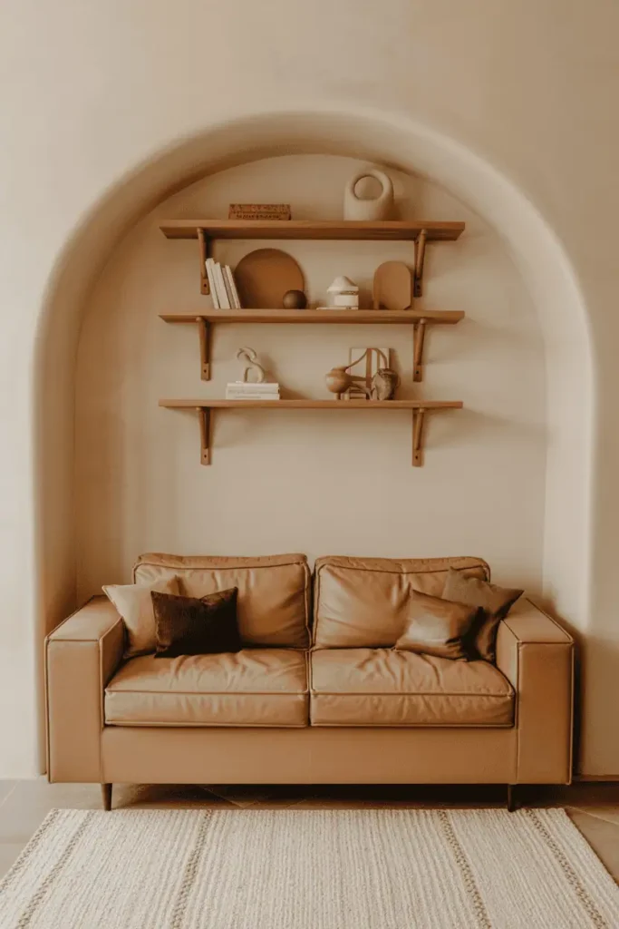
3. Rich Chocolate and Espresso Tones
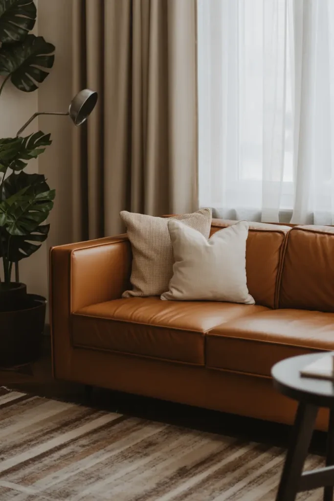
For depth and sophistication, few colors compete with chocolate brown and espresso. These deep tones bring an indulgent, luxurious feel to your living room. Leather sofas in espresso are especially stunning because they age gracefully, acquiring character over time.
Balance these darker tones with lighter accents: cream trim, ivory pillows, or warm metallic details. The contrast keeps your room from feeling heavy while still offering that rich, cocoon-like warmth.
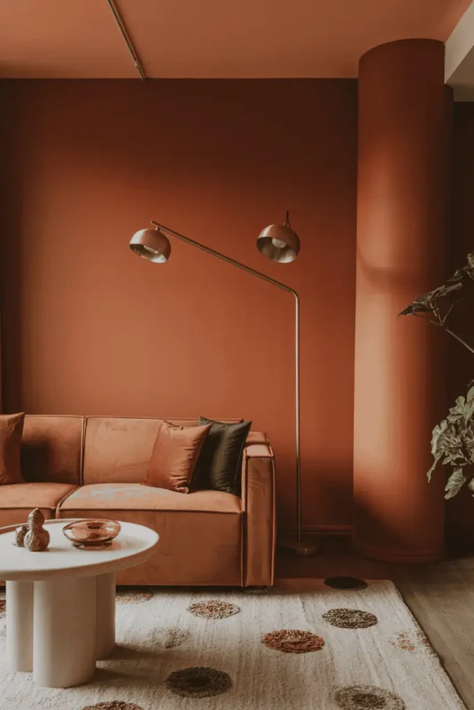
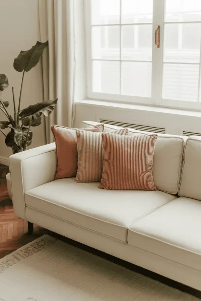
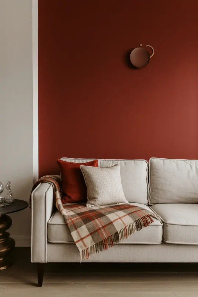
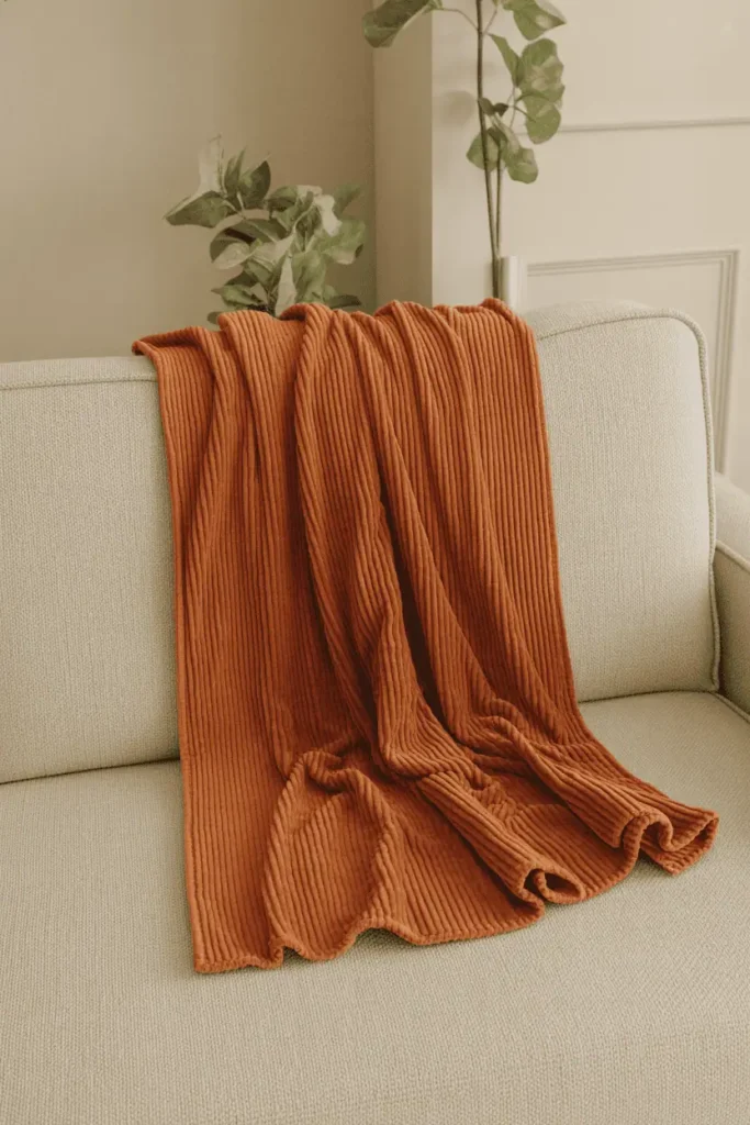
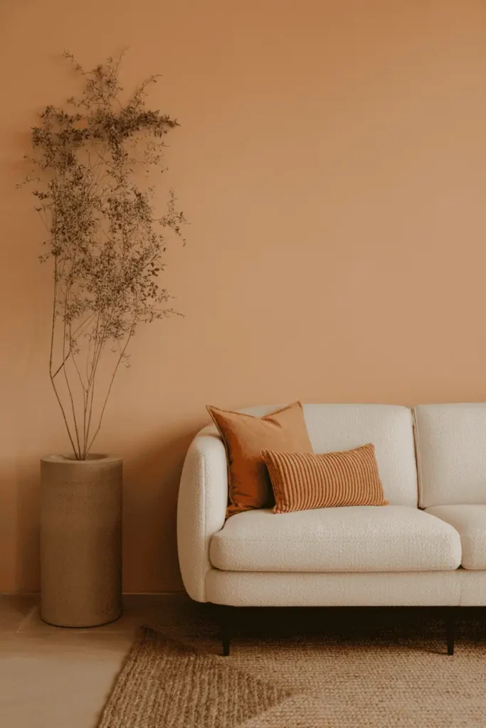
4. Terracotta and Burnt Sienna
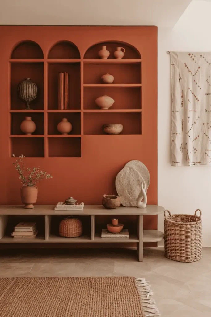
Clay-inspired shades like terracotta and burnt sienna are perfect for injecting earthy warmth into your living space. They evoke Mediterranean villas and desert landscapes, bringing a natural, organic quality to interiors.
Use them strategically: an accent wall, pottery, rugs, or even throw pillows. Their reddish-brown undertones work beautifully with rustic wood furniture and cream textiles. If you want a palette that feels both grounded and stylish, terracotta is a winner.
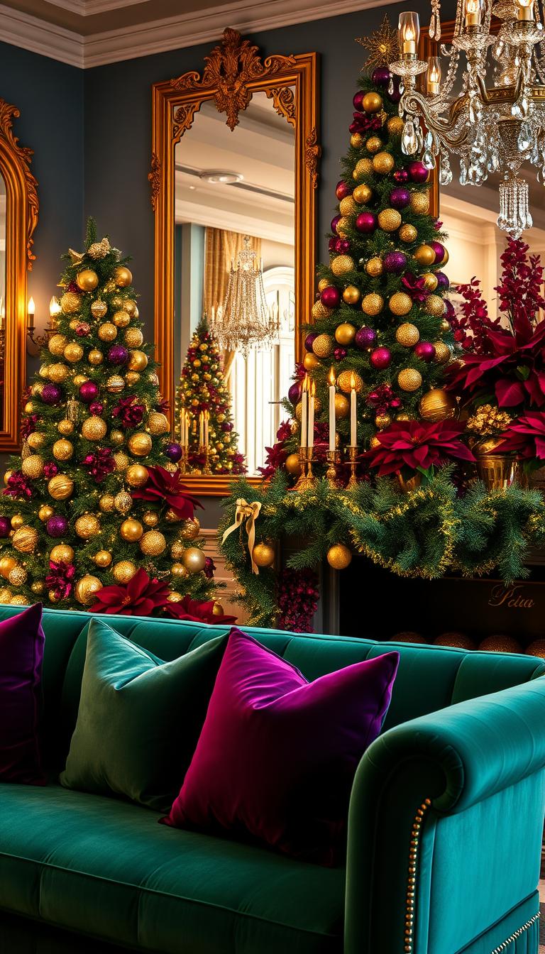
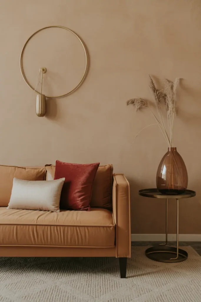
5. Inviting Burgundy and Merlot
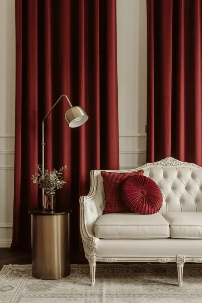
Deep burgundy and merlot are colors that instantly elevate a living room. They’re bold enough to create drama but warm enough to keep things cozy. These wine-inspired hues shine in fabrics: velvet curtains, silk drapes, plush cushions.
Pair burgundy with soft neutrals like cream and gray to create balance. This palette works beautifully in traditional, eclectic, or even modern spaces, adding richness and intimacy.
6. Coral and Dusty Rose
If you want warmth without intensity, coral and dusty rose are wonderful choices. They offer a gentler take on red that feels cheerful and romantic. These colors thrive in naturally lit rooms, bouncing light beautifully for a fresh, welcoming vibe.
Dusty rose pillows, coral rugs, or accent chairs in these shades can transform your space without overwhelming it. They pair well with cream, warm gray, and natural wood.
7. Bold Crimson Accents
Sometimes boldness pays off. Crimson is powerful, dramatic, and unforgettable. The trick is to use it thoughtfully: a single crimson accent wall, a rug, or even a statement piece of furniture.
Because crimson is so commanding, balance it with warm neutrals. Beige, taupe, and mushroom gray soften its intensity while allowing the vibrancy to shine.
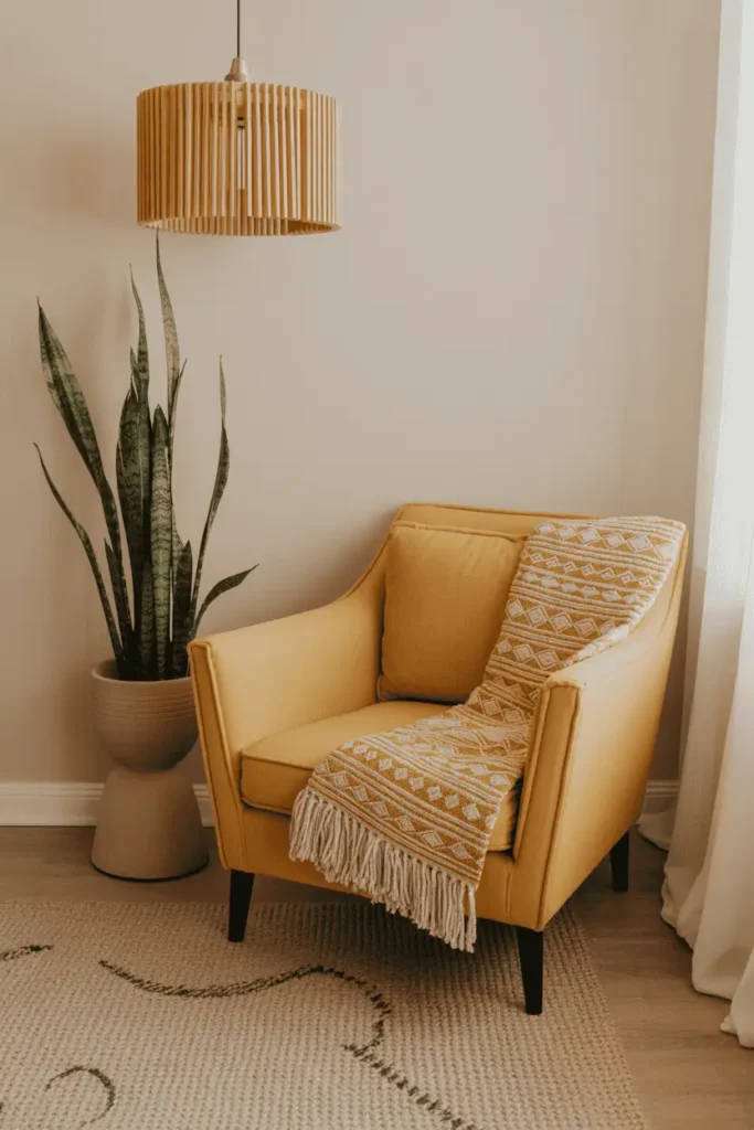
8. Golden Yellows
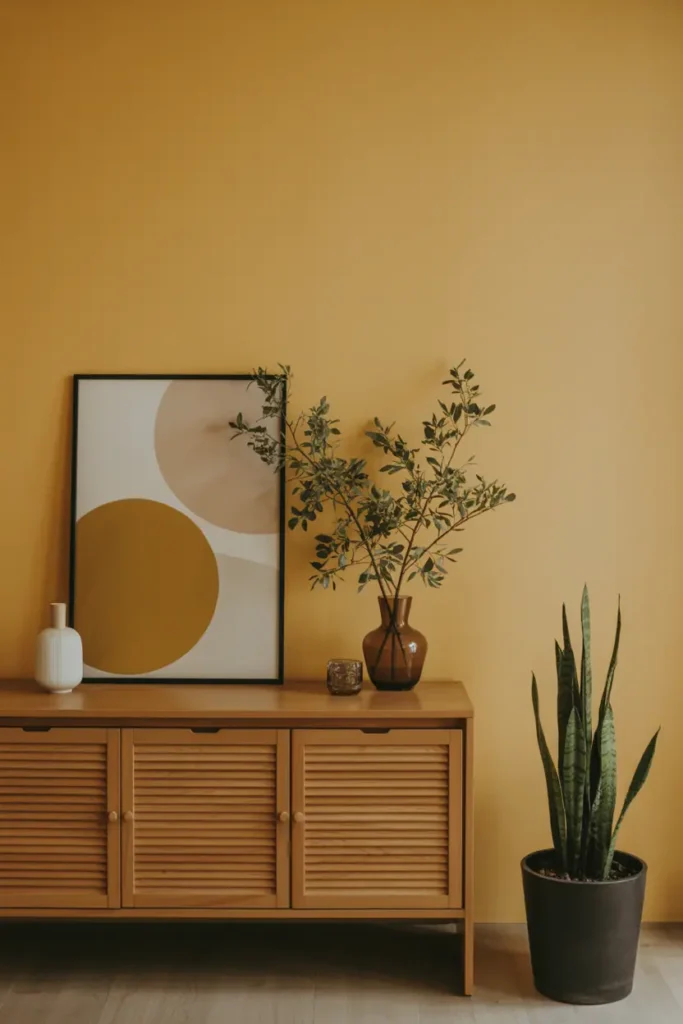
Few colors brighten a room quite like golden yellow. It creates instant sunshine, transforming even the gloomiest spaces into cheerful sanctuaries. Golden yellows work beautifully with natural wood, cream fabrics, and rustic textures.
These shades are especially helpful for small or dark living rooms where natural light is limited. They bounce light around, making the space feel larger and more inviting.
9. Mustard Yellow Retro Charm
Mustard yellow offers a nostalgic, retro-inspired warmth that’s also deeply stylish. It’s bold yet earthy, making it versatile for both bohemian and mid-century modern living rooms.
This color shines on accent chairs, rugs, or feature walls. Pair it with teal, deep brown, or cream for a palette that feels both playful and sophisticated.
10. Honey Gold and Amber
For a touch of understated luxury, honey gold and amber are excellent choices. These hues feel like candlelight captured on your walls. They’re deeper than bright yellows but still exude warmth and elegance.
Use them in transitional or traditional spaces, pairing with brass fixtures or copper accents to enhance the golden glow. They make any room feel instantly more polished.
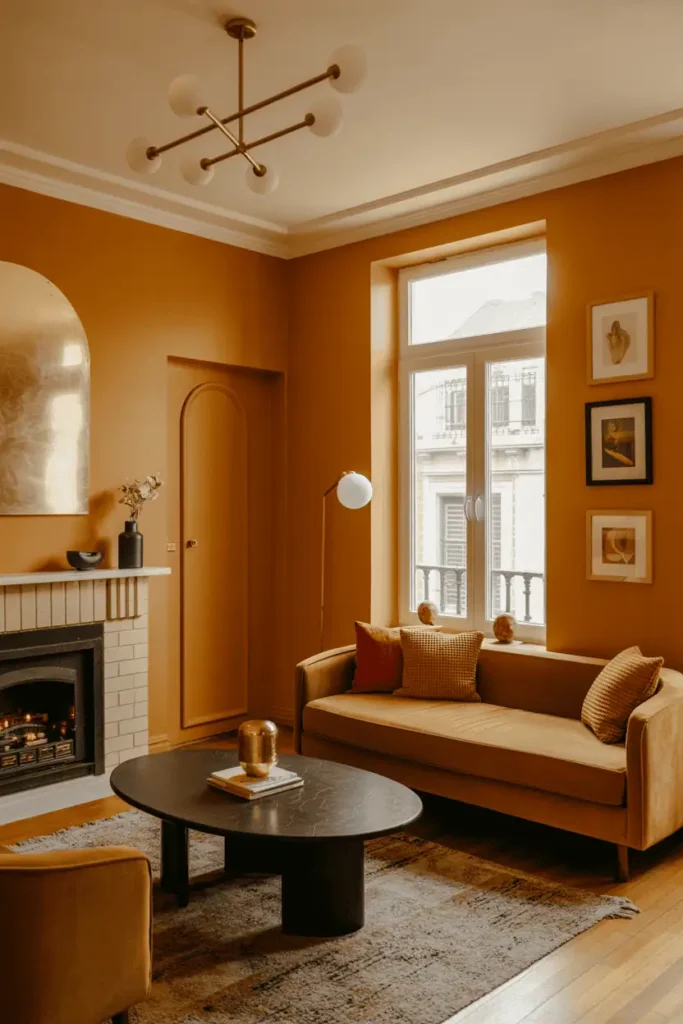
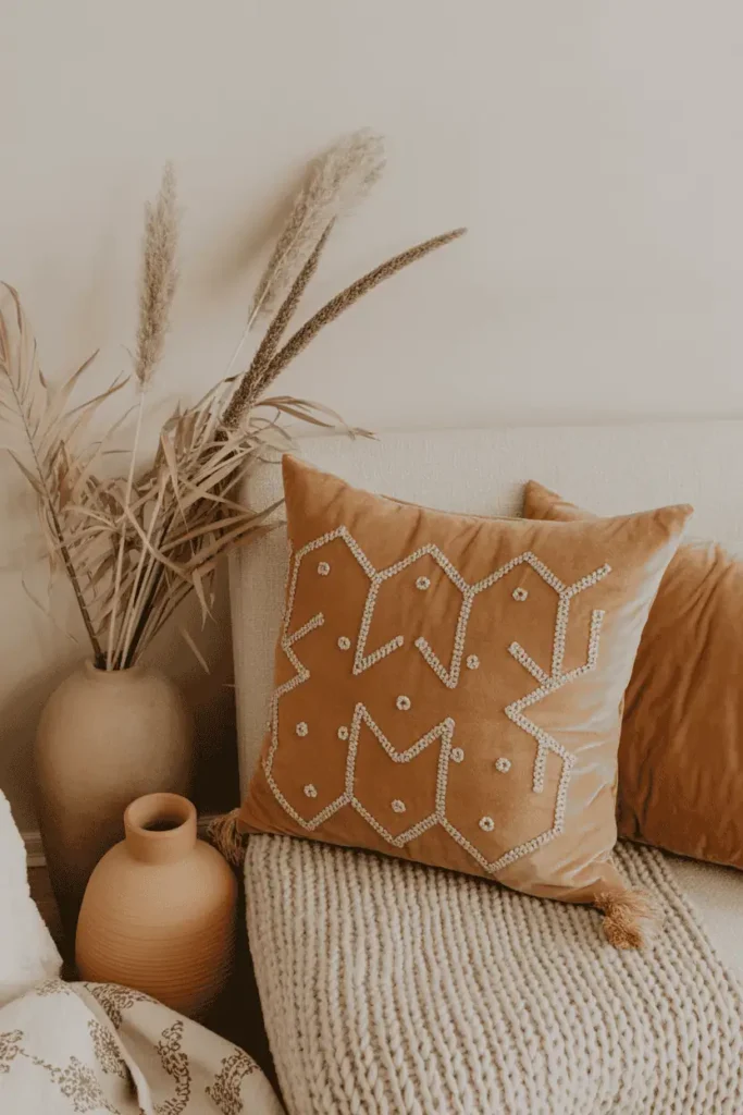
11. Burnt Orange and Pumpkin Spice
Burnt orange and pumpkin spice tones bring autumnal coziness year-round. They’re rich without being overpowering, offering a sense of comfort and energy at once.
These shades look fantastic in textiles: throws, pillows, or rugs. They also pop in wall art or pottery. For a perfectly cozy palette, combine burnt orange with warm beige and cream.
12. Peach and Apricot Softness
Peach and apricot tones are soft, versatile, and uplifting. They create a gentle warmth that feels fresh and modern. These colors are ideal for airy living rooms with lots of natural light.
Pair peach walls with ivory furniture, or apricot throws with a mushroom-gray sofa. The result is a serene space that still feels cozy and inviting.
13. Greige: The Perfect Warm Gray
Greige — the blend of gray and beige — has become a design darling for good reason. It’s neutral, sophisticated, and incredibly versatile. As a wall color, greige provides warmth without overwhelming a room.
Greige pairs beautifully with colorful accents, making it an excellent choice if you like to switch decor seasonally. It also complements natural wood and metallic finishes.
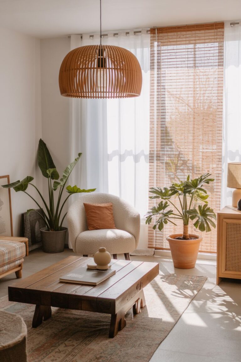
14. Cream and Ivory Foundations
Sometimes simplicity is best. Cream and ivory are timeless shades that provide a serene backdrop while allowing textures and accent colors to shine. They’re especially effective in layering — think cream walls, ivory curtains, and a camel sofa.
This foundation makes it easy to switch up your decor throughout the year while maintaining a warm, welcoming atmosphere.
15. Camel and Sand Color Stories
Camel and sand tones evoke desert landscapes and earthy luxury. They’re warm without being overpowering, offering a versatile base that can lean rustic, bohemian, or elegant.
Pair camel and sand with warm browns, whites, or metallic accents for a layered, sophisticated look. These tones are understated yet powerful.
How to Layer Warm Colors Effectively
Having a palette is just the beginning. How you apply those colors makes all the difference.
- The 60-30-10 Rule: Use 60% of a dominant warm neutral, 30% of a secondary hue, and 10% as an accent. Example: beige walls (60%), coral cushions (30%), crimson throw (10%).
- Monochromatic Layers: Stick to a single color family (camel, taupe, chocolate) but vary intensity and texture for depth.
- Gradient Transitions: Start with lighter warm tones on the walls, deepen with furniture, and finish with bold accessories.
The Role of Lighting and Finishes

Lighting can make or break your warm palette. Always choose warm white bulbs (2700K–3000K) to enhance golden undertones. Cool bulbs will dull warm colors and make them feel flat.
- Matte finishes absorb light, adding richness and depth.
- Satin finishes reflect light, brightening your space.
- Textured finishes like color washing or sponge painting add character and patina.
Pair your palette with warm metallics — brass, bronze, or copper — for a polished, cohesive look.
Seasonal Adaptations
One of the best things about warm palettes is how easily they adapt throughout the year.
- Autumn: Layer in burgundy, burnt orange, and mustard through pillows and throws.
- Winter: Embrace deeper tones like chocolate, forest green, and merlot with heavier textiles.
- Spring: Lighten things with peach, buttery yellow, and coral accents.
- Summer: Keep it breezy with sandy beige, honey gold, and apricot.
These small adjustments ensure your living room always feels fresh, cozy, and in sync with the seasons.
Conclusion
A warm living room is more than just a design choice — it’s an atmosphere, a feeling. By choosing the right warm colors and layering them thoughtfully, you can create a space that welcomes, comforts, and inspires. From earthy neutrals to bold crimsons, each palette has the power to transform your living room into the true heart of your home.
Start small: a throw pillow here, an accent wall there. Then build your palette over time. The beauty of warm colors is that they grow with you, creating a timeless sanctuary that always feels like home.